This page hopes to address the webpage design tasks set out by yourselves. If you’d like any more clarification on any of the areas I’ve highlighted, please feel free to get in touch about them.
In the first task, my short analysis hopes to point our both the good elements on the “trial box” page, as well as those which can be improved.
In the second task, I’ve linked both the Figma design page as well as the presentation file for your consideration.
Thank you for your time.
Nathan Hall
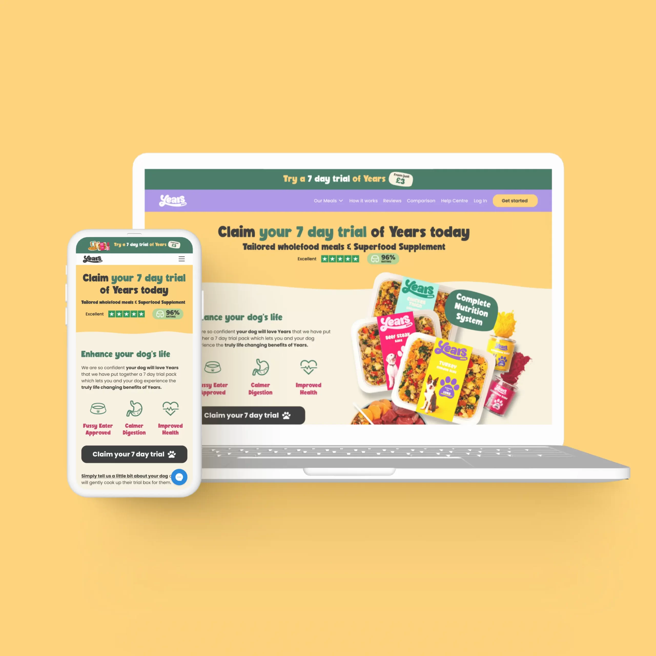
Above-the-fold content is the part of a web page shown before scrolling. Any content you’d need to scroll down to see, would be considered ‘below-the-fold’. The ‘fold’ is where the browser window ends, but the content continues underneath.
This analysis hopes to point our both the good elements on the trial box page, as well as those which can be improved.
Please hover over the tooltips to see comments.
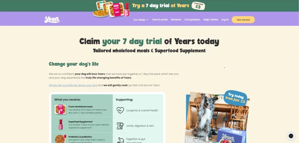
Linked announcement
bar to 7 day trial
Good separation of
action as a button
Customer service option clearly
visible. Would consider branding
this button if possible.
Benefit of Years
I have changed the wording here
to be more positive "Enhance your dog's life"
Great photo of dog, but doesn't add much value to product. What will the customer be getting?
Inconsistent typeface
I go in to more detail below.
CTA below the fold
Image interferes with the navigation.
Is the nav ever seen without the trial?
This short analysis hopes to point our both the good elements on the trial box page, as well as those which can be improved.
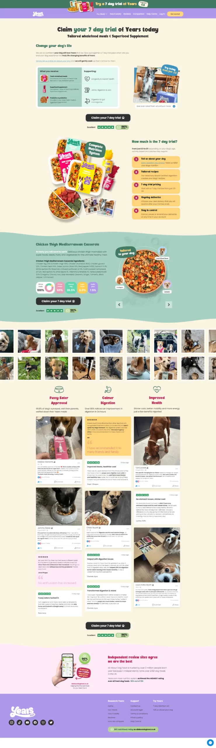
“Claim your 7 day trial” button should be brought up to above the fold, requiring no scrolling from the user to claim the offer. An option for this could be a sticky bottom bar with a CTA which follows the user down the page as they scroll.
An example of this feature here (scroll to view): Thriva.com
All written reviews link to “www.years.com/pages/pages/reviews” instead of “www.years.com/pages/reviews”. Poor user experience for people who want to read more reviews.
Consider using Trustpilot widget in this section as this can display up-to-date reviews and can be set to only display 5-star reviews as an example.
The main title of the page should have a H1 class, however it is a H4.
There are a lot of other H1 classes on the page however which should be addressed, being the titles of the dishes and the names of the reviewers. This can impact negatively on SEO performance for this page.
All pages on your site should include an H1, and the header should appear only once at the top of the page. An H1 is known as the HTML tag that is used to display the main heading of a web page.
Overall colour contrast is good but could be improved in some areas.
Websites should strive for a AAA rating, however in some areas this page is failing which may affect user journey, as well as google ranking.
Some body copy is slightly on the small side – though an acceptable size for mobile and desktop it may not be ideal for all customers with less-than-perfect vision.
In most places the font is correctly set to Poppins for body copy and BoldenVan for Headings. However, in two places on the nav menu, both “Our meals” and “Get started” use ui-sans-serif, a generic font which may change depending on browser.
Messaging is clear and consistent throughout the page. Key benefits are outlined well so the customer knows exactly what the product is.
Lots of reminders to the customer of company trust with Trustpilot and allaboutdogfood.co.uk links.
High quality images improve trust factor with the brand and will promote a quality product.
WebP format is also being used for a number of images of the site. This is a relatively new format, but is great for websites as its a very lightweight format, whilst retaining image quality. Great for page load speed.
Although this page succeeds in many areas, there is still much room for improvement from a CRO standpoint, as well as an SEO, and User Experience one.
The page follows the Years.com brand guidelines well but care should be taken in terms of correct styling of page elements, as some of these are mismatched and may not have the same user experience across devices.
Areas I’ve drawn attention to should be addressed in due course. A landing page such as this would benefit from various A/B tests to ensure the best conversion rate.
Please find below links to the Figma project file for this brief. You should have the option to view both desktop and mobile views in the presentation. I have approached the task with a few points in mind:
Above the fold – Bringing important, actionable elements above the fold aims to increase conversion rate.
I mention in task one how some websites use a sticky element to ensure that CTA is permanently visible throughout the page, although I have not included this in my design it would be another choice moving forward.
Features & Benefits – Making sure that the user knows how this product is going to benefit them, or more specifically their prized pooch. Highlighting these features above-the-fold is key to answering the “Why should I buy?” question.
If you have any issues, feel free to contact me at nathanrhall@hotmail.co.uk.
The pages are also downloadable as pdf format here.